UZAIR ALI

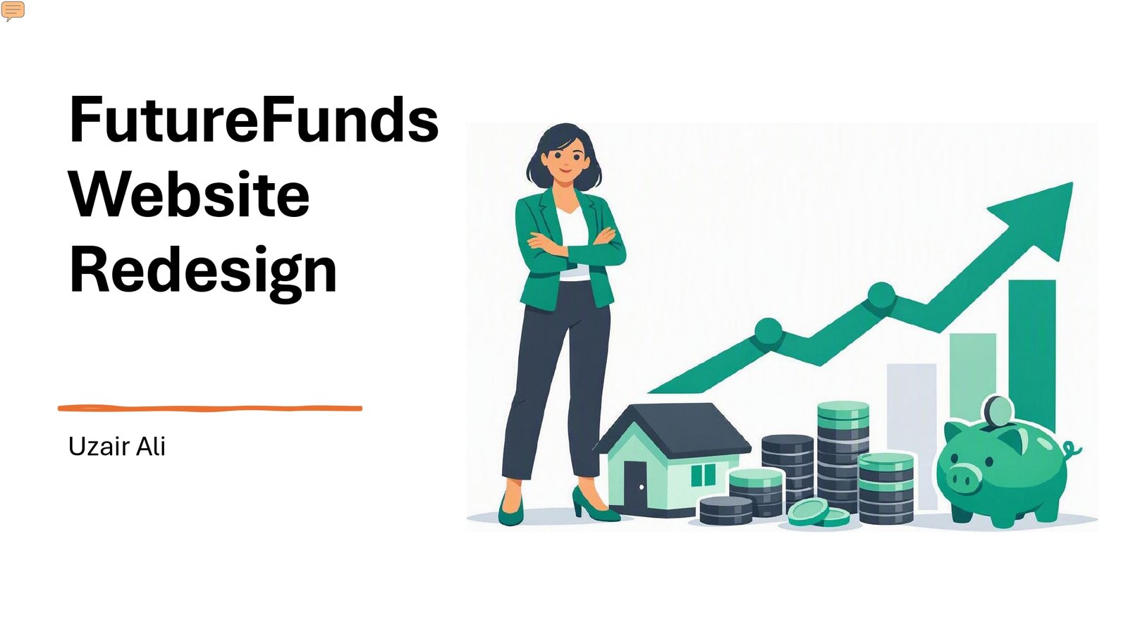
Website Redesign

Future Funds

A user-centered website redesign for FutureFunds, created to improve clarity, navigation, trust, and the overall experience for young professionals seeking financial guidance.

PROJECT OVERVIEW

Redesigning the FutureFunds Experience

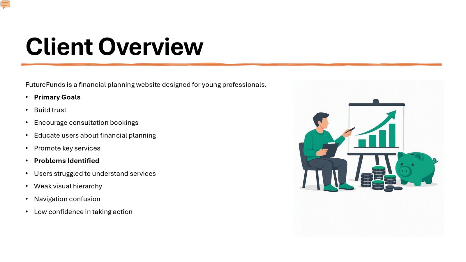
FutureFunds is a financial planning service focused on helping young professionals make informed decisions about their financial future. The redesign aimed to strengthen the company’s online presence by creating a clearer landing experience that builds trust, communicates services effectively, educates users, and encourages consultation bookings.

Project Type

Website Redesign

Deliverables

Desktop Website Design

Mobile Website Design

High-Fidelity Prototype

Responsive Landing Experience

Target Audience

Young Professionals

Ages 22–35

Design Focus

User Experience

Visual Hierarchy

Navigation

Accessibility

Conversion

TOOLS & SKILLS

Tools & Skills

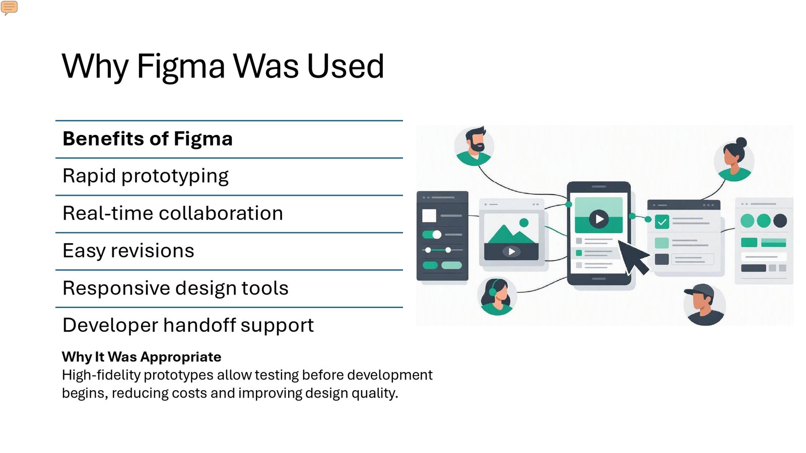
The project used Figma to develop high-fidelity prototypes, support responsive design, make revisions efficiently, and prepare designs for development handoff.

UI/UX Design
User Experience
Visual Design
Visual Hierarchy
Responsive Design
Information Architecture
Accessibility
Interaction Design
Prototyping
Usability Testing
DESIGN CHALLENGE

Improving a Confusing User Experience

The original design contained several usability issues that made it difficult for users to understand FutureFunds,
navigate the page, and confidently take action. User feedback revealed problems with clutter, unclear buttons,
confusing content structure, and a complicated consultation process.
01 ─────

Clarifying the Value Proposition

Users struggled to understand what FutureFunds did and needed clearer information about the company and its services before taking action.

02 ─────

Improving Navigation

The original design used unclear buttons and similar arrow icons, making it difficult for users to understand where different actions would take them.

03 ─────

Reducing Visual Clutter

Users described the original page as overwhelming because too many elements competed for attention and there was insufficient space between items.

04 ─────

Simplifying Consultation

The consultation experience needed to become easier to understand and less overwhelming, particularly because users found the original appointment form excessively long and confusing.

USER RESEARCH & FEEDBACK

What Users Told Us

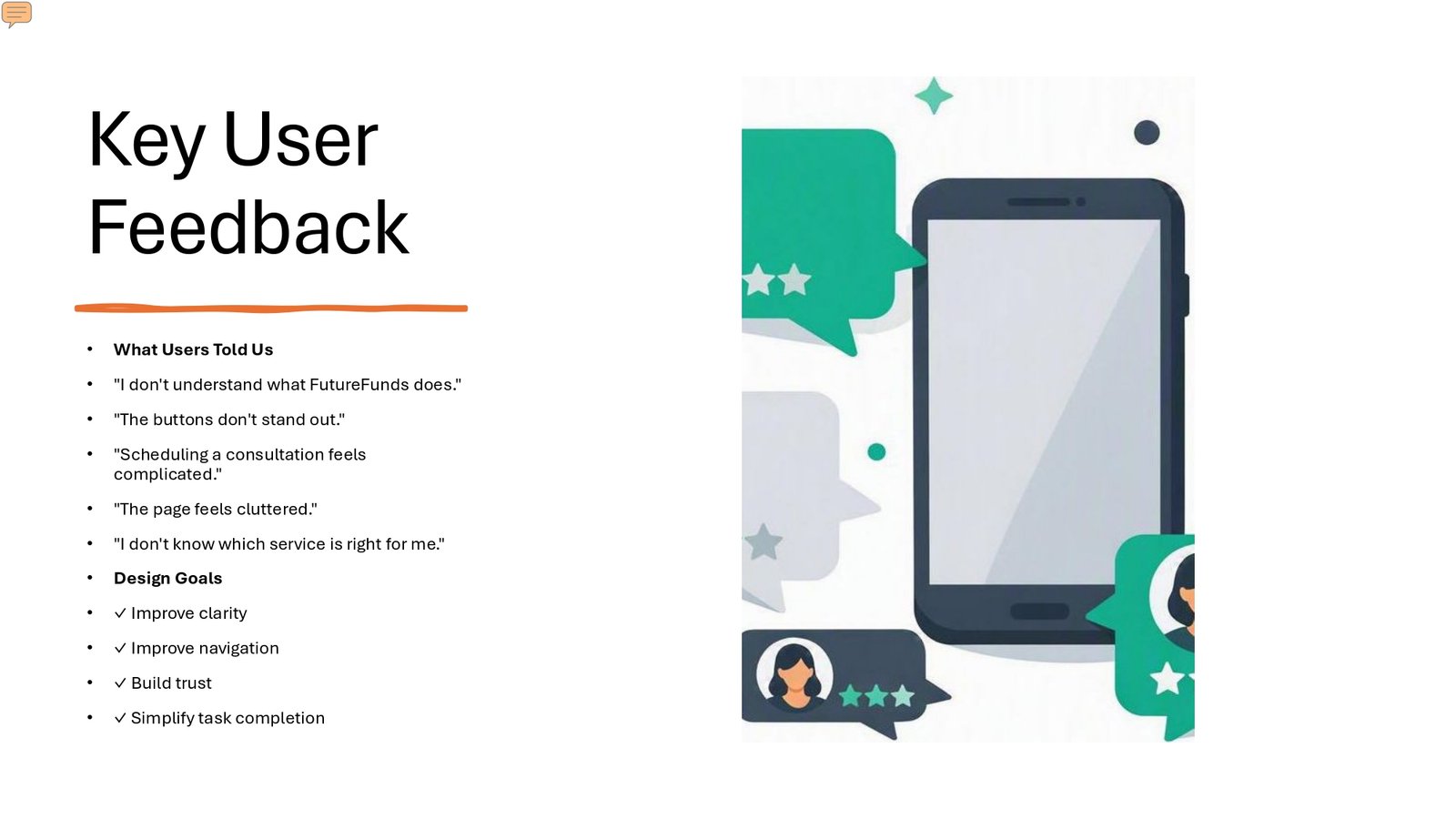
User interviews were conducted to evaluate the initial wireframes and understand how users interpreted the design
without being told what type of company the website represented. Their feedback revealed
01 ─────

Unclear Company Purpose

Users struggled to understand what FutureFunds did before being asked to schedule a consultation.

02 ─────

Complicated Scheduling

The appointment scheduler appeared too early and the form contained too many fields, causing users to feel overwhelmed.

03 ─────

Unclear Content

Users were unsure whether certain cards represented pages, blog posts, news articles, or other content because their purpose was not clearly explained.

04 ─────

Too Much Information

Users described the original design as cluttered and difficult to process because too many elements competed for attention.

DESIGN OBJECTIVES

Turning Feedback Into Design Goals

01 ─────

Improve Clarity

Make the company’s purpose and value proposition immediately understandable to new visitors.

02 ─────

Improve Navigation

Create clearer navigation and more recognizable calls to action so users understand what to click and where it will lead.

03 ─────

Build Trust

Use trust indicators and organized content to help prospective clients feel more confident about FutureFunds.

04 ─────

Simplify Task Completion

Make important actions such as exploring services, using the calculator, and scheduling a consultation easier to understand and complete.

DESIGN PROCESS

From Research to Redesign

01 ─────

User Feedback

User interviews identified confusion around the company’s purpose, navigation, consultation scheduling, content hierarchy, and overall page organization.

02 ─────

UX Analysis

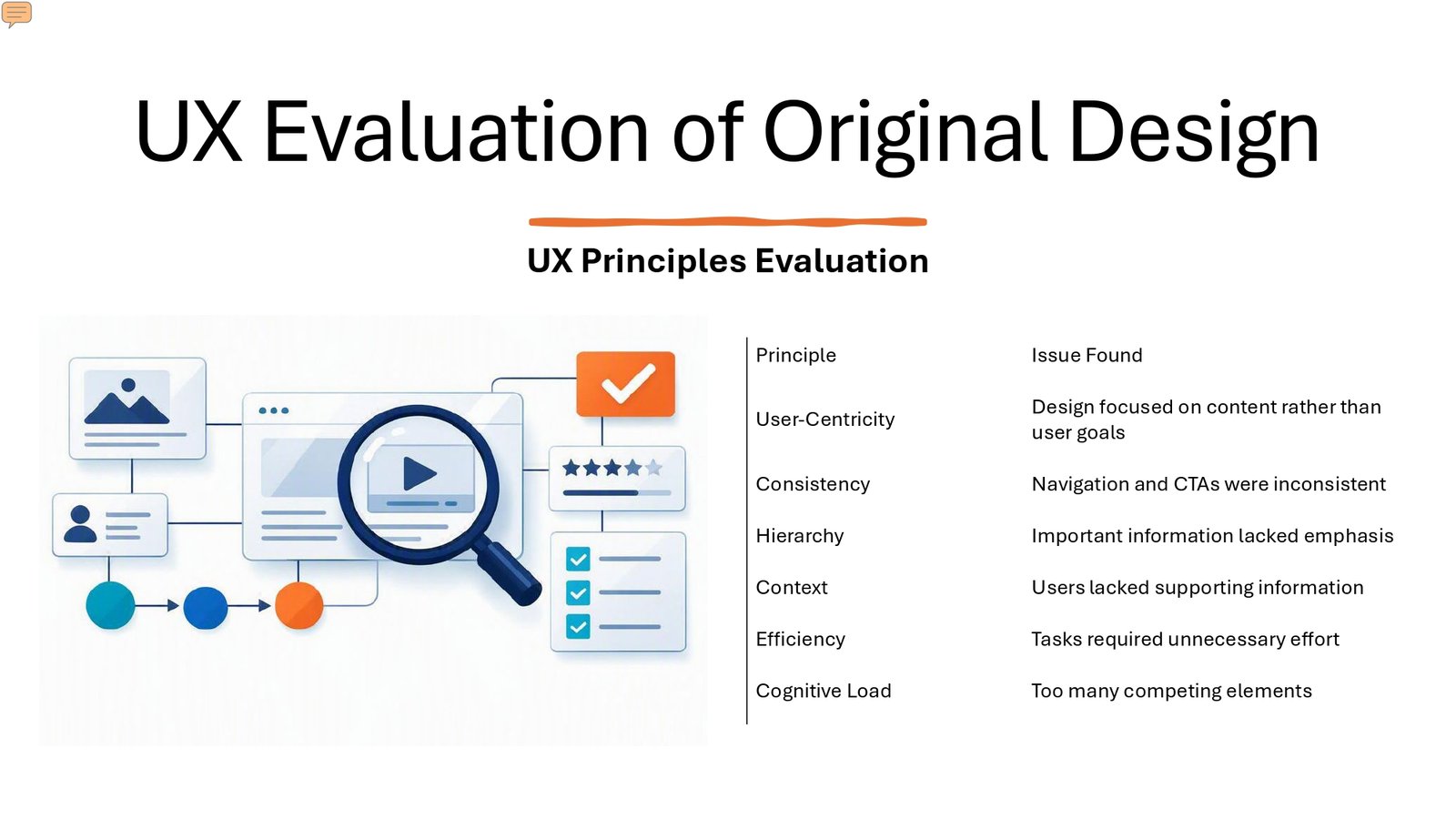
The original design was evaluated using UX principles including user-centricity, consistency, hierarchy, context, efficiency, and cognitive load.

03 ─────

Interface Redesign

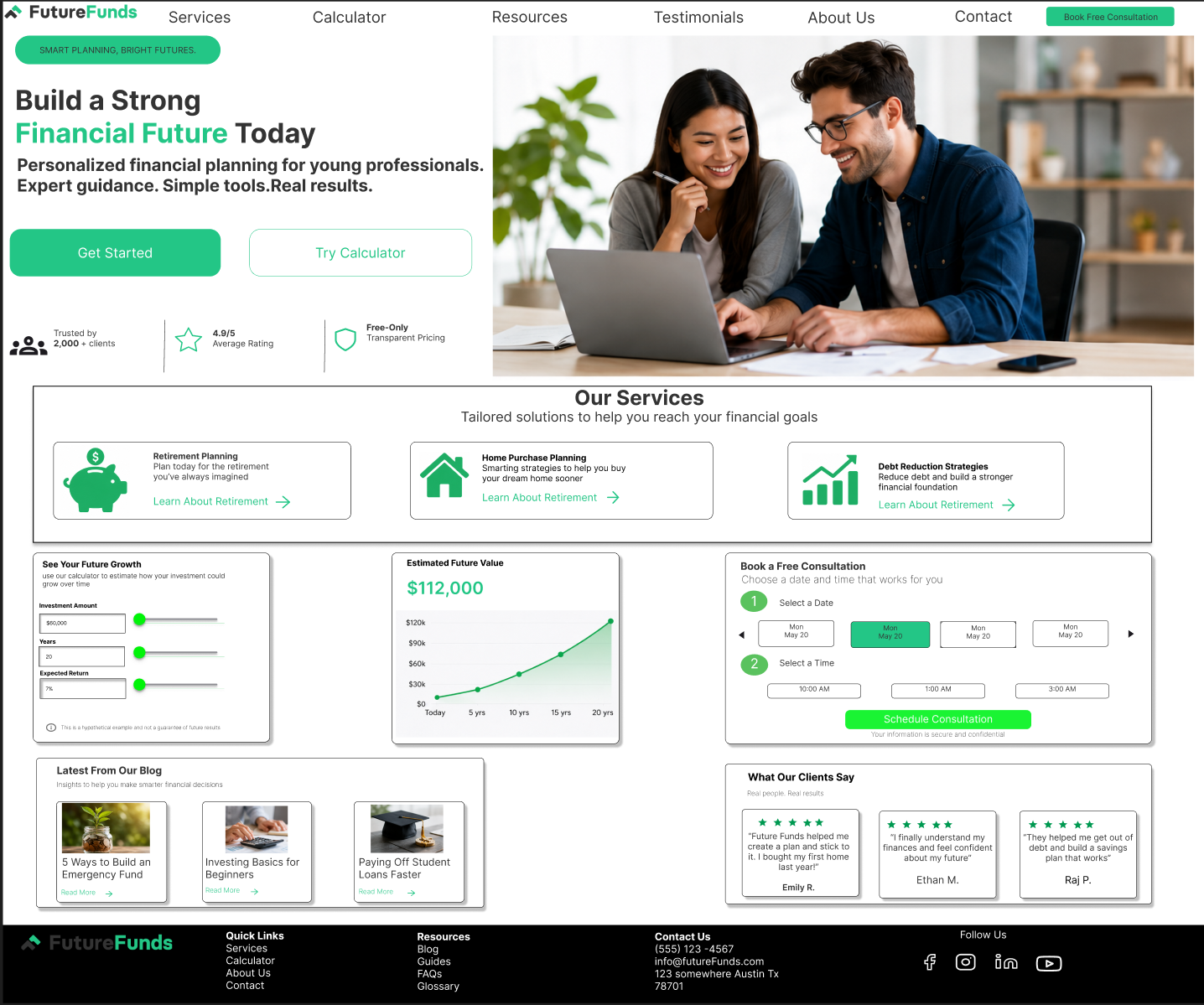
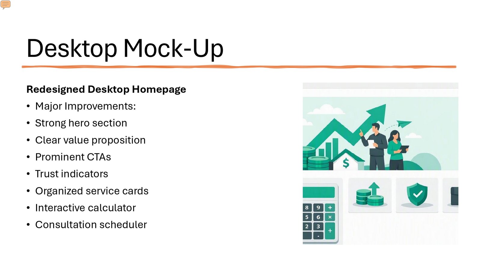
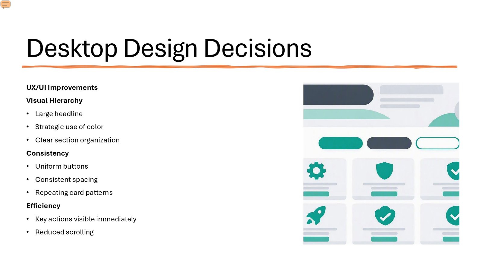
The redesign introduced a stronger hero, clearer calls to action, organized service cards, trust indicators, an interactive calculator, and a consultation scheduler.

04 ─────

Responsive Design

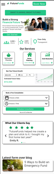
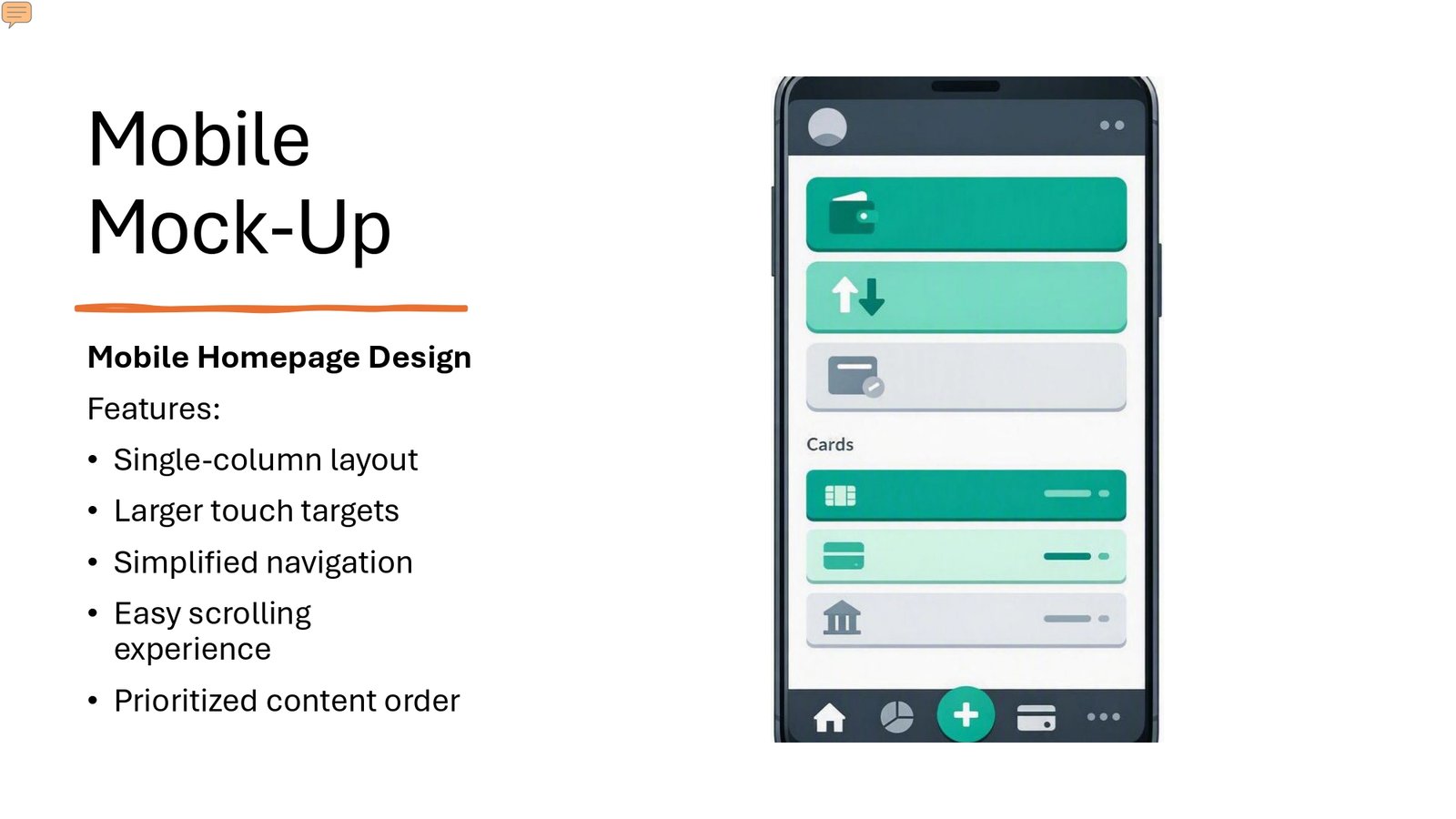
The redesigned experience was adapted for mobile using a single-column structure, larger touch targets, simplified navigation, and prioritized content.

WEBSITE REDESIGN

Redesigned FutureFunds Experience

The redesigned landing page reorganizes the FutureFunds experience around clearer hierarchy, stronger calls to
action, organized services, financial tools, trust indicators, and simplified consultation access.

Strong Hero

A prominent headline and value proposition establish the purpose of the website immediately.

Clear Calls to Action

Consistent and visible CTAs make important actions easier to identify.

Organized Services

Service cards make financial offerings easier to scan and understand.

Financial Tools

The redesign incorporates an interactive calculator and consultation scheduler as key user actions.


Single-Column Layout

Larger Touch Targets

Simplified Navigation

Prioritized Content

RESPONSIVE DESIGN

Designed for Desktop and Mobile

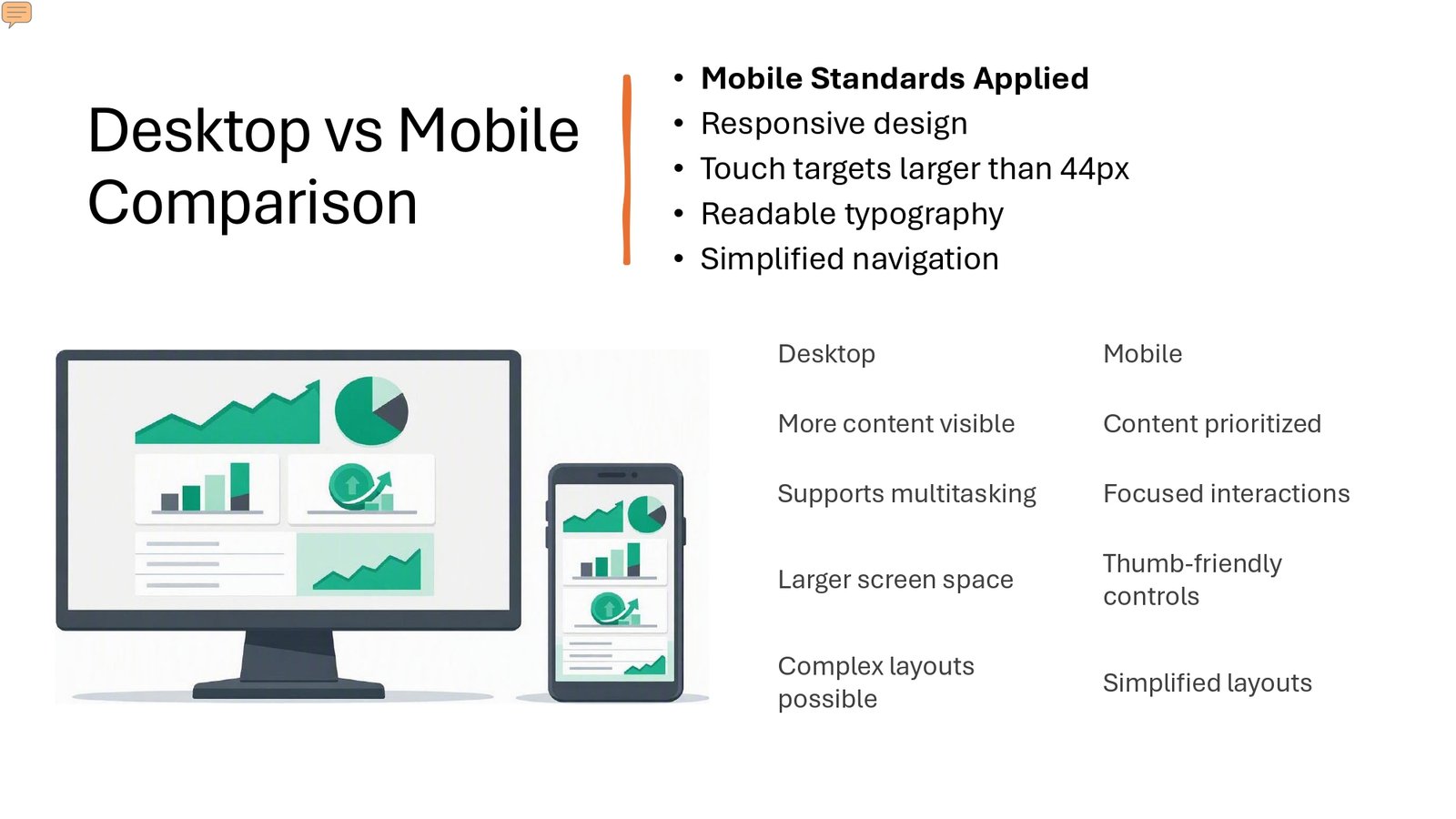
The redesigned experience adapts the FutureFunds landing page to smaller screens by prioritizing content, simplifying navigation, increasing touch-target size, and maintaining readable typography.

ACCESSIBILITY

Designing for Accessibility

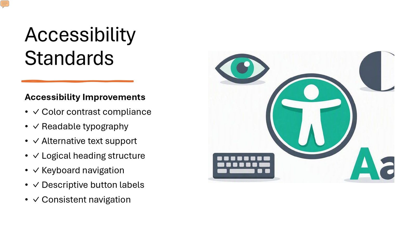
Accessibility considerations were incorporated into the redesign to improve readability, navigation, and interaction across the experience.

Color Contrast

Readable Typography

Alternative Text

Logical Headings

Keyboard Navigation

Descriptive Buttons

Consistent Navigation

FINAL DESIGN GALLERY

Final FutureFunds Experience

A visual collection of the redesigned FutureFunds experience across desktop and mobile,
showcasing the final interface direction and responsive design approach.
NEXT PROJECT

Home Secure

SMART HOME SECURITY

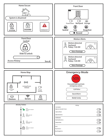
A smart home security interface designed to help users monitor their home, manage connected security devices, review activity, and respond quickly to security events.