● PRINT ADVERTISEMENT
Magazine Advertisement
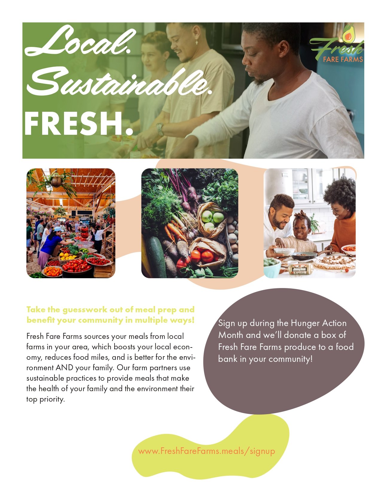
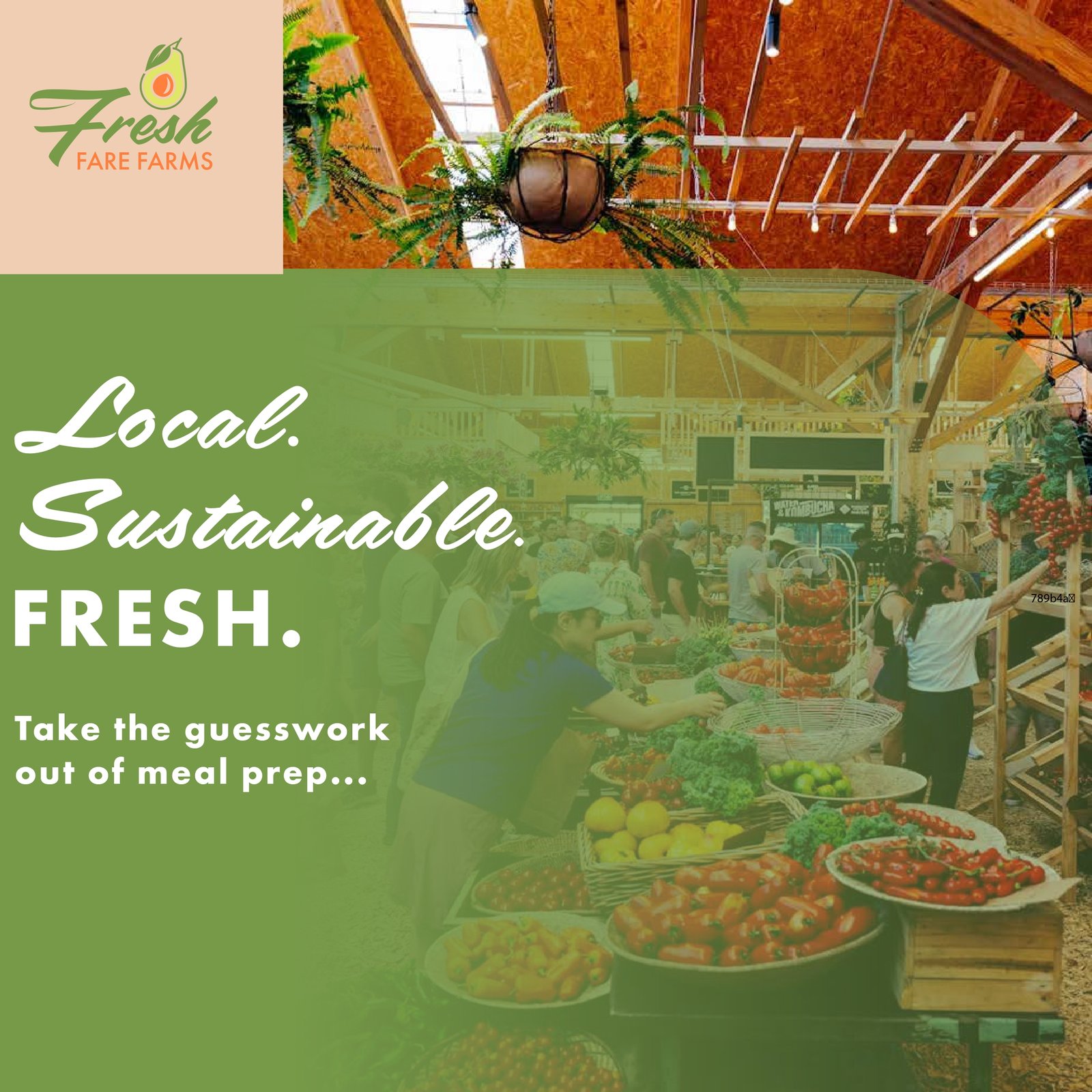
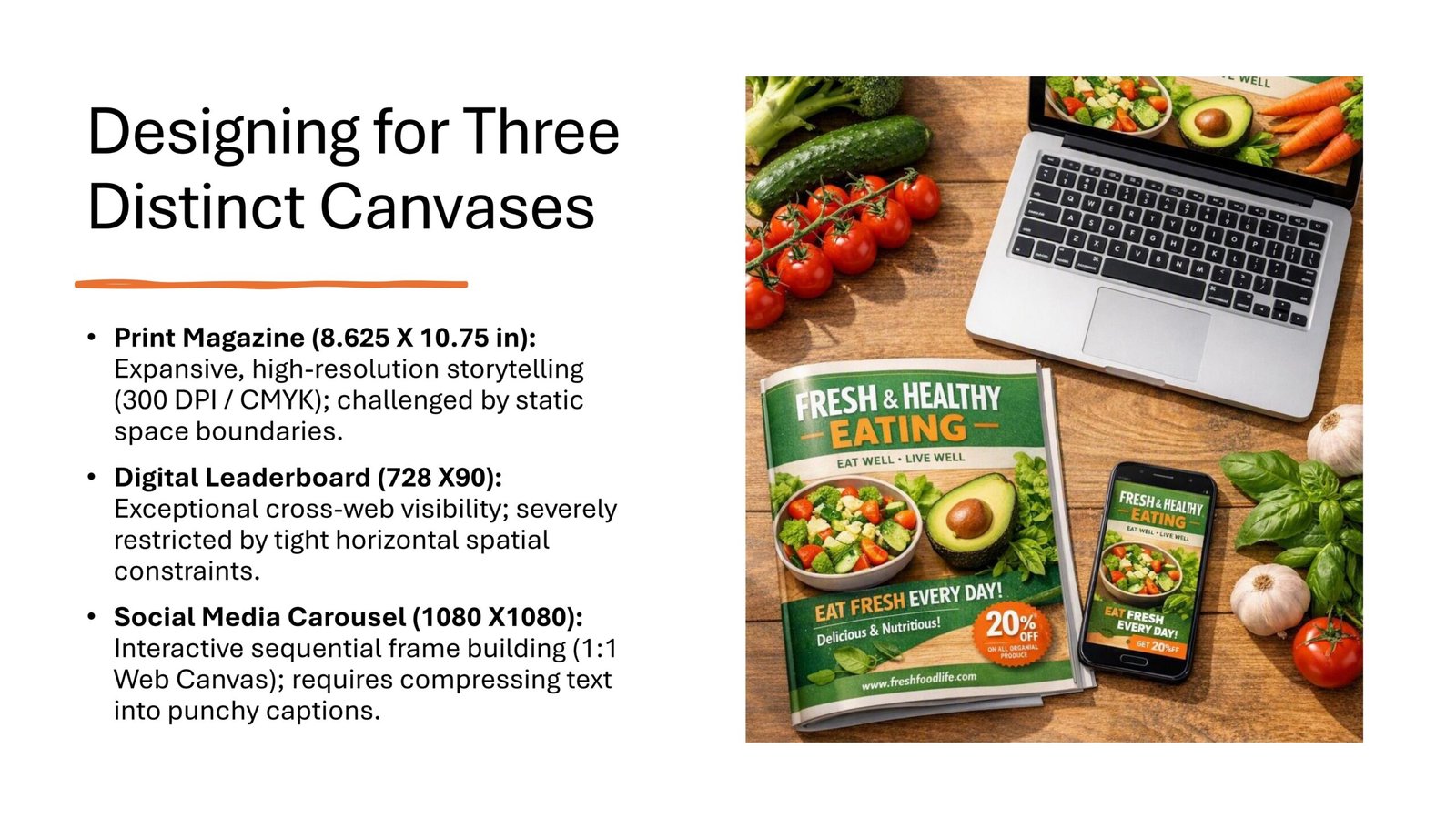
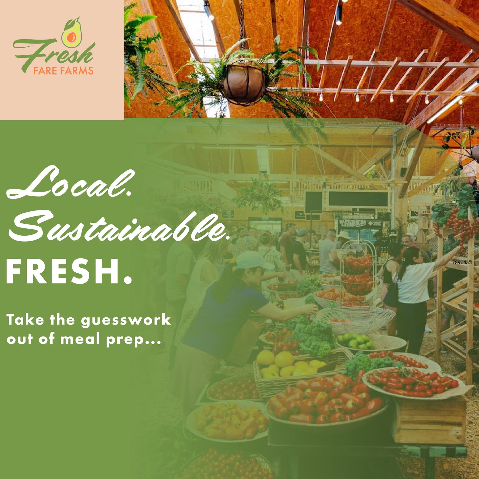
The FreshFareFarms magazine advertisement was designed to introduce the brand through eye-catching visuals, engaging promotional messaging, and a clean editorial layout. The advertisement maintains the campaign’s visual identity while capturing attention in a print publication.
● PRINT ADVERTISEMENT
Editorial Advertising Design
This advertisement was developed for magazine publication, combining bold imagery, clear typography, and promotional messaging to strengthen the ScoopScoop brand. The layout balances visual impact with readability, making the advertisement effective in both print and promotional contexts.
Typography
Clear headline hierarchy and readable supporting text guide the viewer through the advertisement.
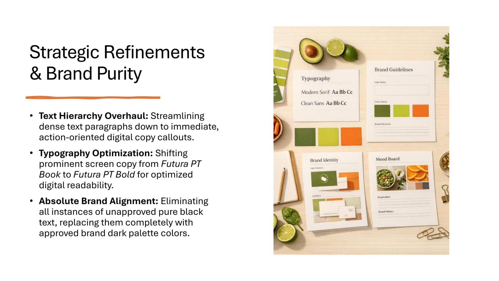
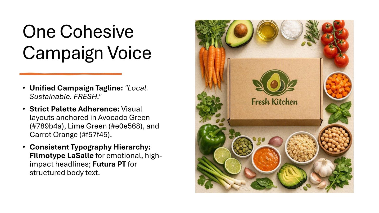
Brand Identity
Consistent colors, graphics, and messaging reinforce the ScoopScoop visual identity.
Promotional Messaging
The advertisement communicates the campaign message clearly while encouraging customer engagement.
Editorial Layout
A structured composition balances imagery and promotional content for an engaging print experience.
The magazine advertisement demonstrates how editorial design and brand consistency work together to create a visually engaging promotional experience.