UZAIR ALI

BRAND IDENTITY DESIGN

RacerX

A playful and accessible brand identity for RacerX, designed to communicate fun, adventure, inclusivity, and excitement while remaining clear and recognizable across digital and print applications.

PROJECT OVERVIEW

Building the RacerX Brand Identity

RacerX needed a visual identity that could communicate its mission to create accessible, family-friendly, and fun gaming experiences. The identity combines a recognizable brandmark, readable wordmark, vibrant colors, and modern typography to create a visual system that feels energetic while remaining approachable and inclusive.

Project Type

Brand Identity Design

Deliverables

Logo

Brandmark

Wordmark

Color Palette

Typography

Target Audience

Millennials — primarily ages 26–41

Design Focus

Brand Identity

Accessibility

Visual Consistency

Brand Recognition

TOOLS & SKILLS

Tools & Skills

The project combines website design, visual communication, layout, and front-end implementation across a multi-page digital experience.

Logo Design
Brand Identity
Visual Identity
Typography
Color Theory
Brand Guidelines
Visual Communication
Accessibility
Audience Research
Market Research
Brand Consistency
DESIGN CHALLENGE

Creating an Accessible and Recognizable Gaming Identity

The RacerX identity needed to balance the energy of the gaming industry with a welcoming,
family-oriented personality. The design also needed to remain readable, accessible, and
consistent across different applications and sizes.

01 ─────

Understanding the Audience

The identity needed to appeal to a technologically adept and socially engaged audience while remaining approachable for players and families with different levels of gaming experience.

02 ─────

Standing Apart

Competitor research showed common use of saturated technology-inspired colors and bold sans-serif typography. RacerX needed to use these industry conventions while developing a friendlier and more family-focused personality.

03 ─────

Balancing Energy & Approachability

The identity needed to communicate excitement and movement without becoming intimidating or overly competitive. Smooth shapes and rounded letterforms help create a lighter, more approachable tone.

04 ─────

Designing for Accessibility

Color contrast and typography were considered to maintain visibility and legibility across light and dark backgrounds and at different sizes, from app icons to billboards.

DESIGN RATIONALE

Designing for Fun, Access, and Recognition

The RacerX logo mock-up was developed using audience analysis, market research, and the company’s vision to create a cohesive, scalable, and accessible visual identity.

01 ─────

Target Audience

The identity was designed for Millennials who are technologically adept, socially engaged, and interested in inclusive and accessible experiences.

02 ─────

Market Research

Competitor analysis identified common use of saturated colors and bold sans-serif typography. RacerX adapts these conventions while introducing a more approachable and family-oriented visual direction.

03 ─────

Brand Personality

Smooth shapes, rounded letterforms, and the selected color palette communicate movement, excitement, and a light informal personality without creating an intimidating gaming aesthetic.

04 ─────

Accessibility

Color choices were tested for sufficient contrast, while typography was selected for legibility across different sizes and applications.


LOGO DEVELOPMENT

From Concept to RacerX Logo

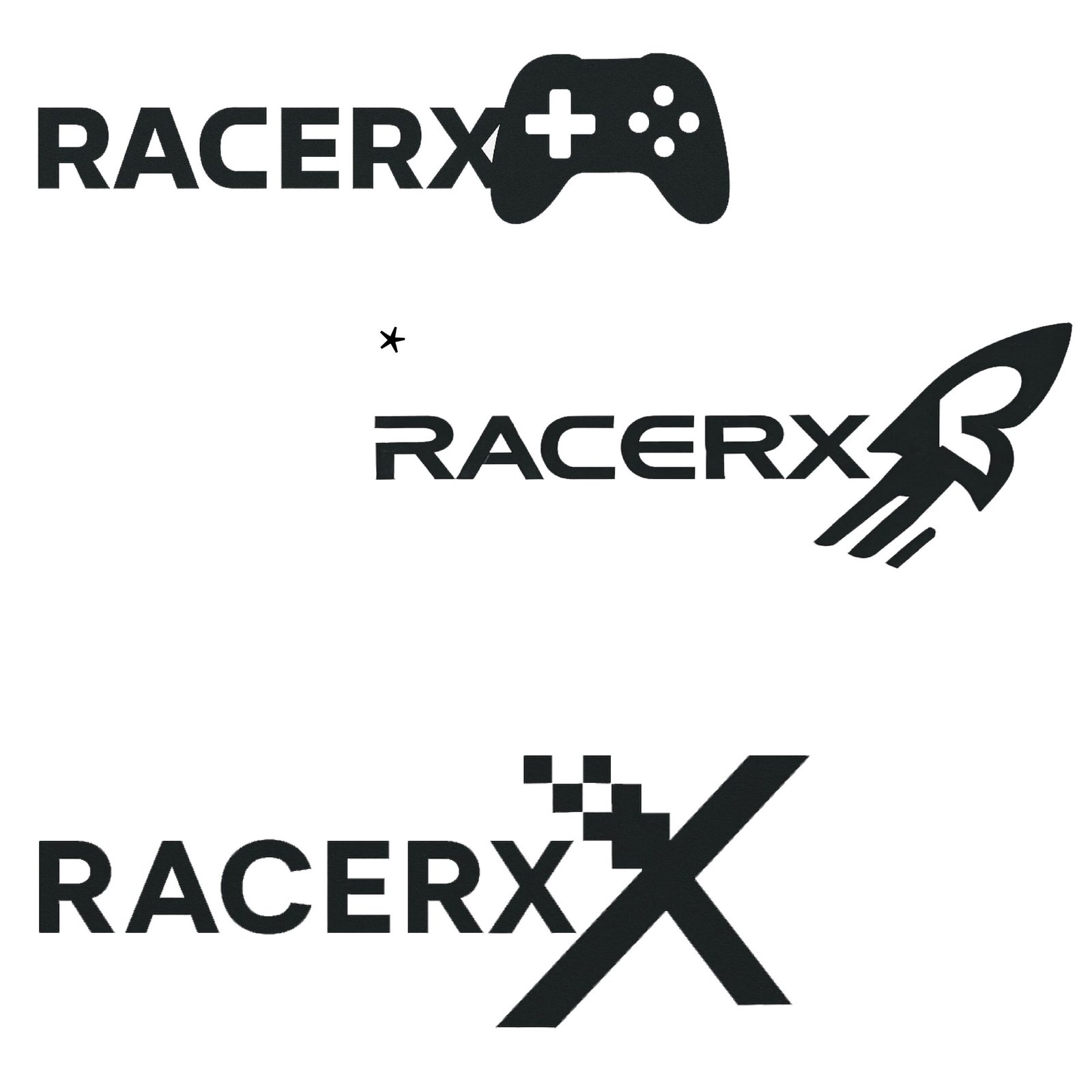
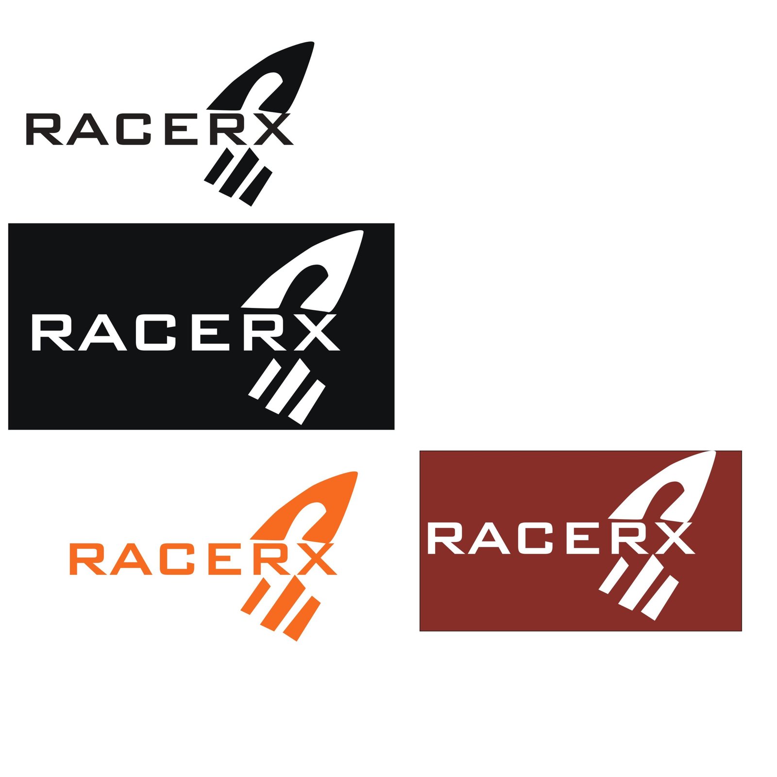
The logo development explored the visual direction of the RacerX identity before establishing the final brandmark and wordmark.

Brandmark

The brandmark uses smooth shapes to communicate movement and excitement while maintaining an approachable personality.

Wordmark

The wordmark uses rounded letterforms to support readability and the brand’s light, informal tone.

Recognition

The identity was designed to remain visually clear across different contexts and sizes.

BRAND STYLE GUIDE

RacerX Brand Style Guide

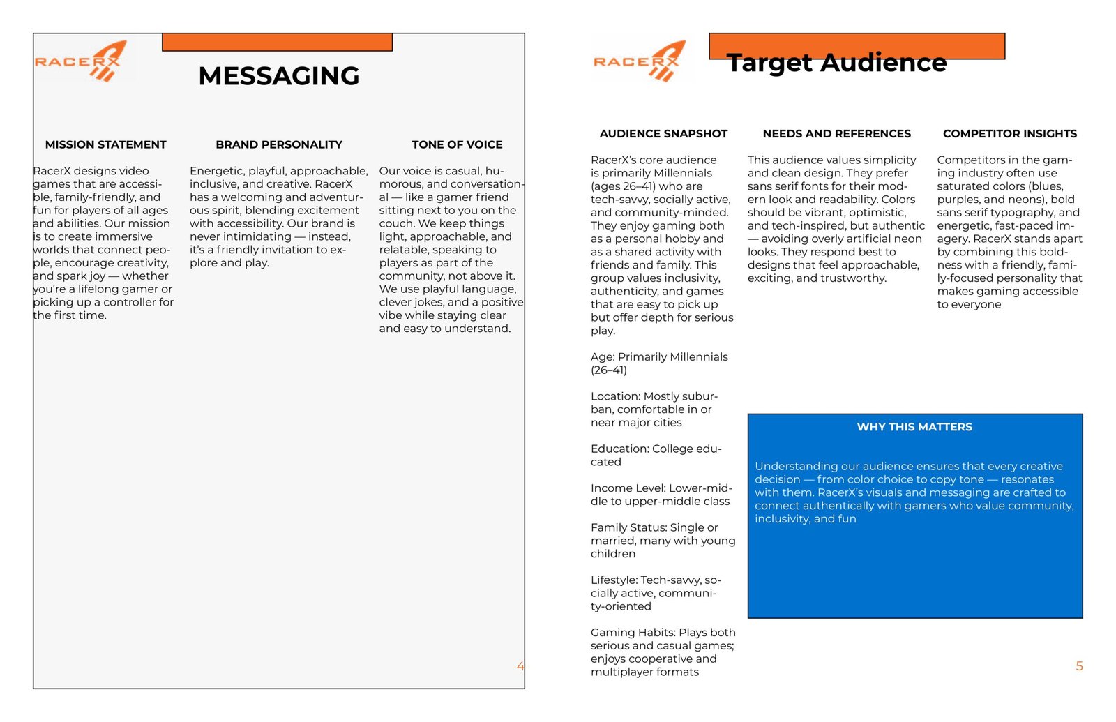
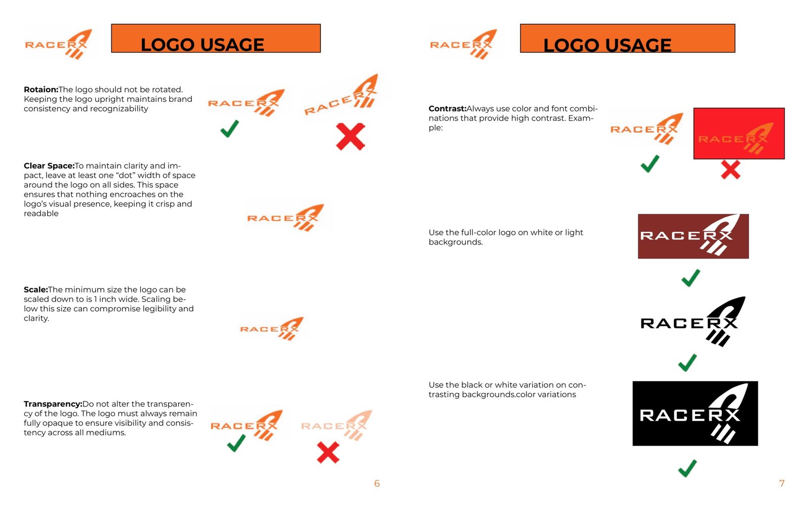
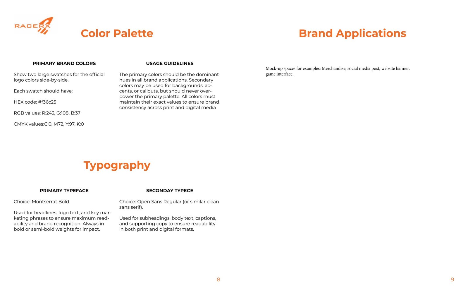
The RacerX Brand Style Guide establishes the visual and verbal identity of the brand, providing guidelines for messaging, audience, logo usage, color, typography, and brand applications.

COLOR & TYPOGRAPHY

RacerX Visual System

Color Palette

The RacerX color system establishes the visual tone of the brand while providing a consistent foundation for brand communication.

PRIMARY COLOR

#F36C25

RGB 243 / 108 / 37

CMYK 0 / 72 / 97 / 0

Typography

RacerX uses a combination of bold display typography and readable supporting text to create hierarchy across brand communications.

Aa
PRIMARY TYPEFACE

Creating Better Digital Experiences

Montserrat Bold

Used for

Aa
SECONDARY TYPEFACE

Creating Better Digital Experiences

Open Sans Regular

Used for

BRAND APPLICATIONS

Designed for Multiple Brand Touchpoints

The RacerX visual system was created to remain consistent across different brand applications, including merchandise, social media posts, website banners, and game interfaces.

01 ─────

Merchandise

Brand application

02 ─────

Social Media

Digital communication

03 ─────

Website Banner

Web application

04 ─────

Game Interface

In-game environment

FINAL BRAND GALLERY

RacerX Brand Identity Collection

A final collection of the RacerX visual identity, bringing together the logo, brand applications,
color direction, and supporting brand materials.
NEXT PROJECT

All Star Logo

LOGO IDENTITY

A versatile brand identity developed through multiple concept explorations, typography refinement, and scalable applications suitable for digital and physical brand touchpoints.