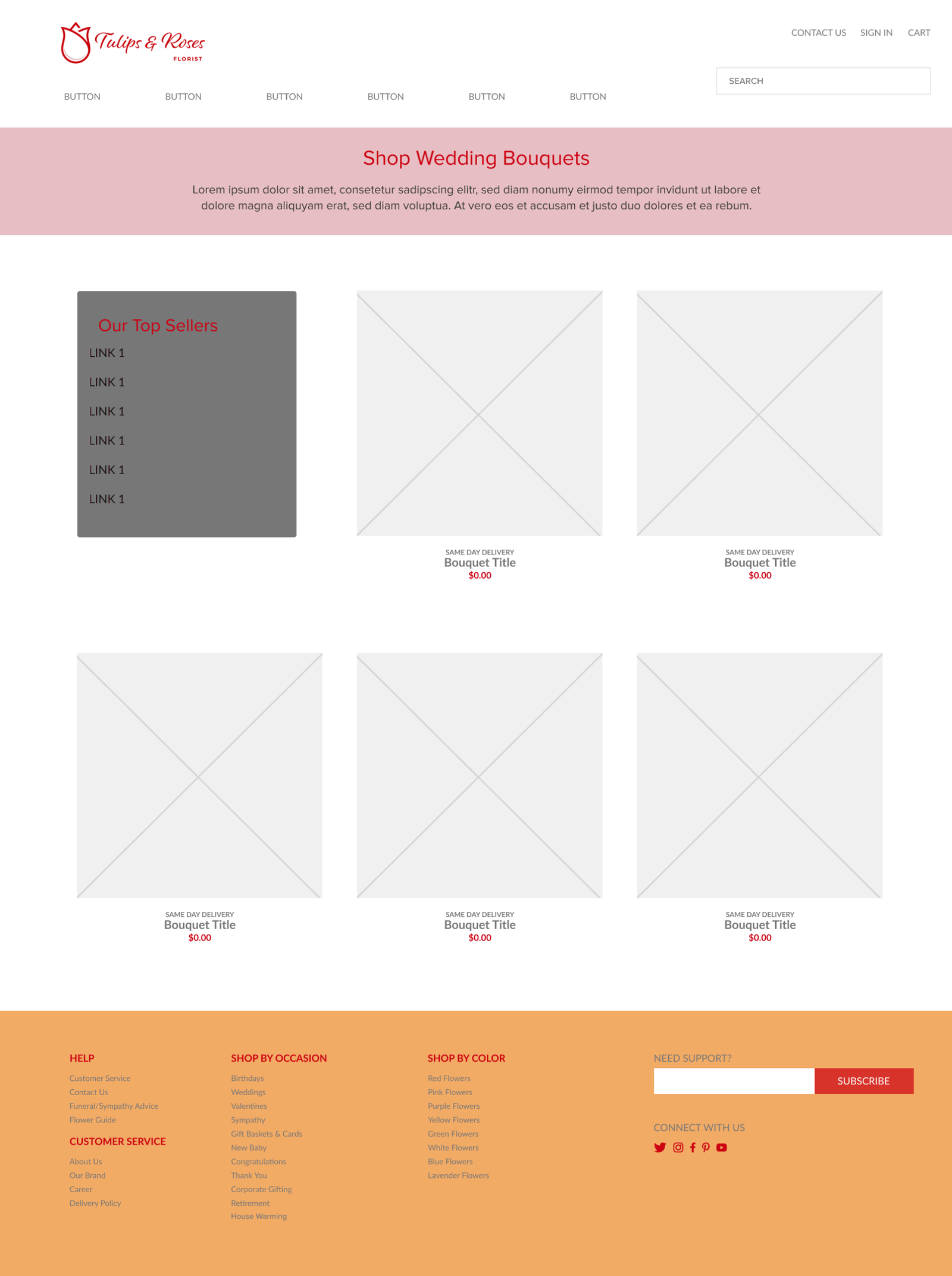
The Tulips & Roses project focused on developing a cohesive UI/UX experience supported by a clear visual direction. The design process considered the client’s needs while bringing together interface design, visual styling, and interactive prototyping to create a consistent and engaging experience.
Project Type
UI/UX Design
Deliverables
UI/UX Design
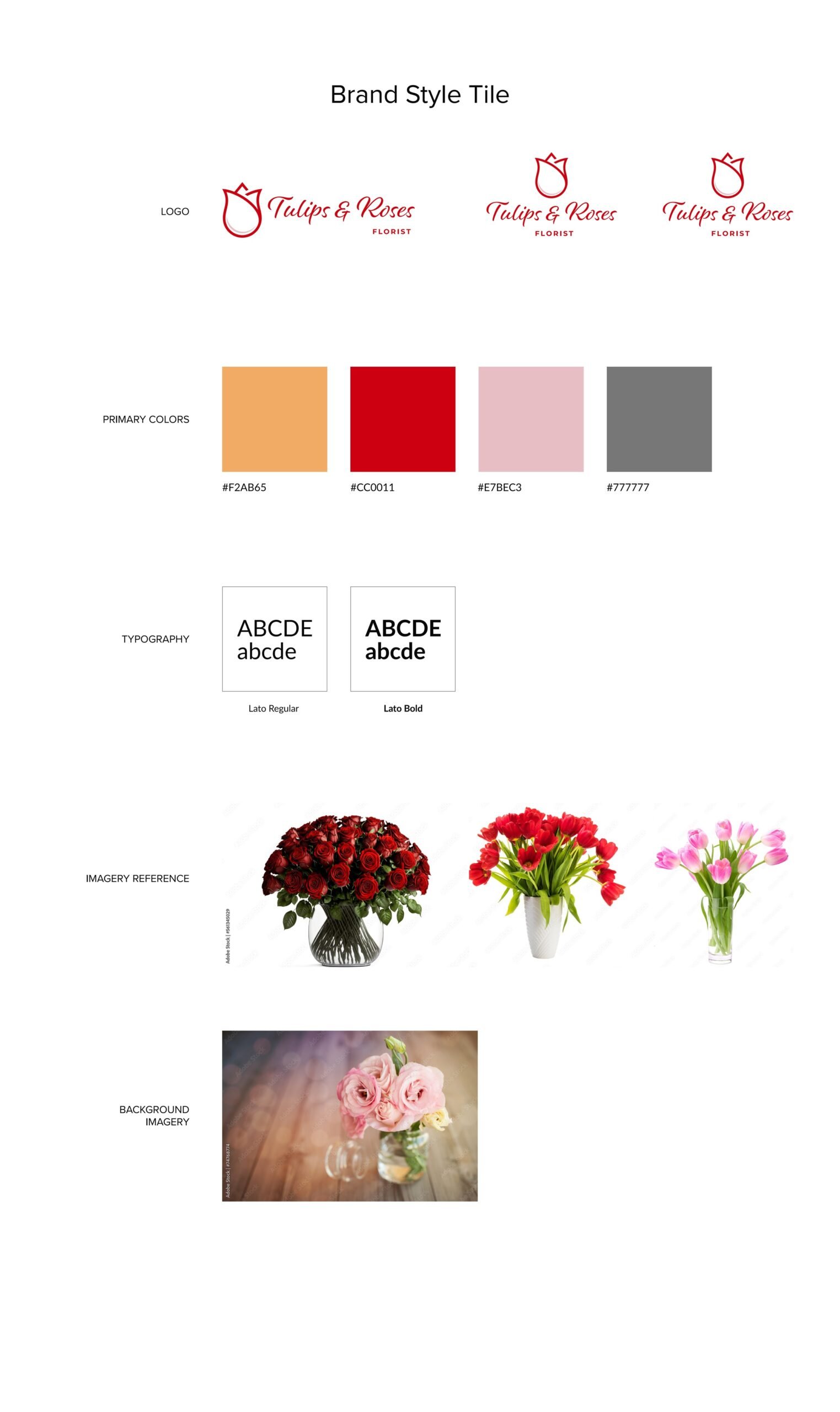
Visual Style Tile
Visual Style Tile
Interactive Prototype
Mock-Up
Target Audience
As specified in Client Needs
Design Focus
User Experience
Visual Communication
Brand Consistency
TOOLS & SKILLS
Tools & Skills
The project combines UI/UX design, visual communication, typography, and interactive prototyping to create a cohesive and accessible digital experience.
UI/UX Design
User Experience
Visual Design
Interface Design
Editorial Design
Visual Hierarchy
Typography
Brand Consistency
Interactive Prototyping
● DESIGN CHALLENGE
Designing a Clear and Cohesive User Experience
The Tulips & Roses project required a thoughtful approach to both user experience and visual communication. The design process focused on understanding the project requirements, establishing an appropriate visual direction, and developing an interface that communicates the Tulips & Roses identity clearly.
01 ─────
Client Needs
The design process began by identifying the project’s requirements and translating the client’s needs into a clear visual and user experience direction.
02 ─────
User Experience
The interface needed to provide a clear and intuitive experience, helping users understand and interact with the content while keeping the overall experience visually cohesive.
03 ─────
Visual Direction
A consistent visual direction was established to connect the interface with the Tulips & Roses identity and create a recognizable and cohesive design language.
04 ─────
Design Communication
The final design brings together visual elements, layout, and interface structure to communicate the Tulips & Roses identity clearly and consistently.
● DESIGN PROCESS
Building a Unified, Accessible Experience
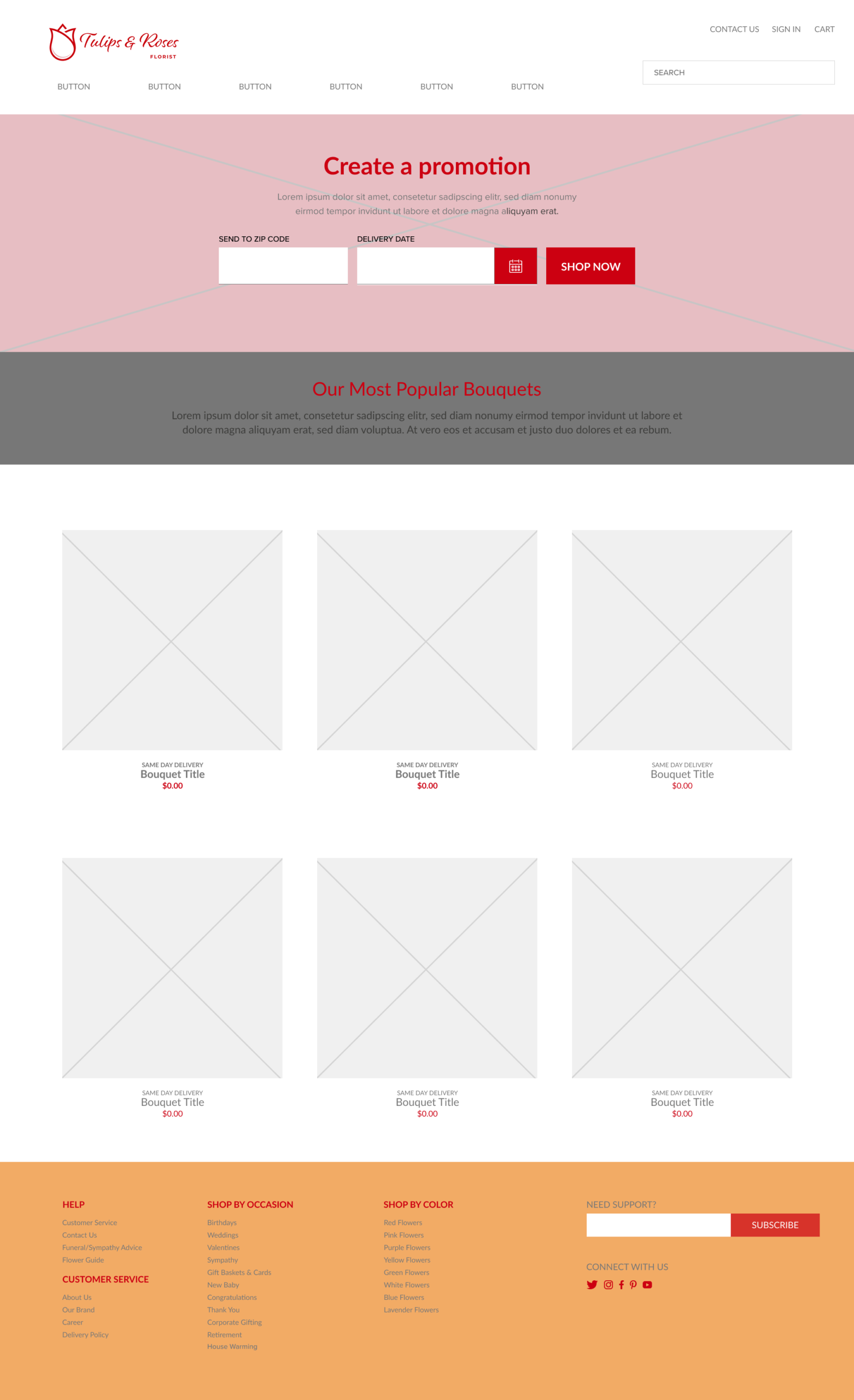
The high-fidelity Tulips & Roses mock-up combines the brand style tile and client requirements with web design and accessibility principles. Color, typography, layout, imagery, and user experience were carefully considered to create a cohesive and usable website experience.
01 ─────
Color & Accessibility
The project begins by exploring different creative possibilities rather than committing immediately to a single visual direction.
02 ─────
TYPOGRAPHY & HIERARCHY
Lato Bold is used for headings and Lato Regular for body text to create a clear typographic hierarchy. Consistent sizing and spacing help guide users from primary headings to supporting information.
03 ─────
Layout & White Space
A grid-based layout organizes the interface while generous white space improves openness and legibility. Consistent alignment and spacing create a balanced presentation across the homepage and contact page.
04 ─────
User Experience
Contrast, alignment, proximity, and repetition support the overall experience. Persistent navigation, clear content placement, accessible typography, and readable color contrast help users navigate and interact with the website.
● BRAND STYLE
Brand Style Tile
The Tulips & Roses brand style tile establishes the visual direction for the website, bringing together the brand’s color palette, typography, imagery, and other visual elements that guide the interface design.
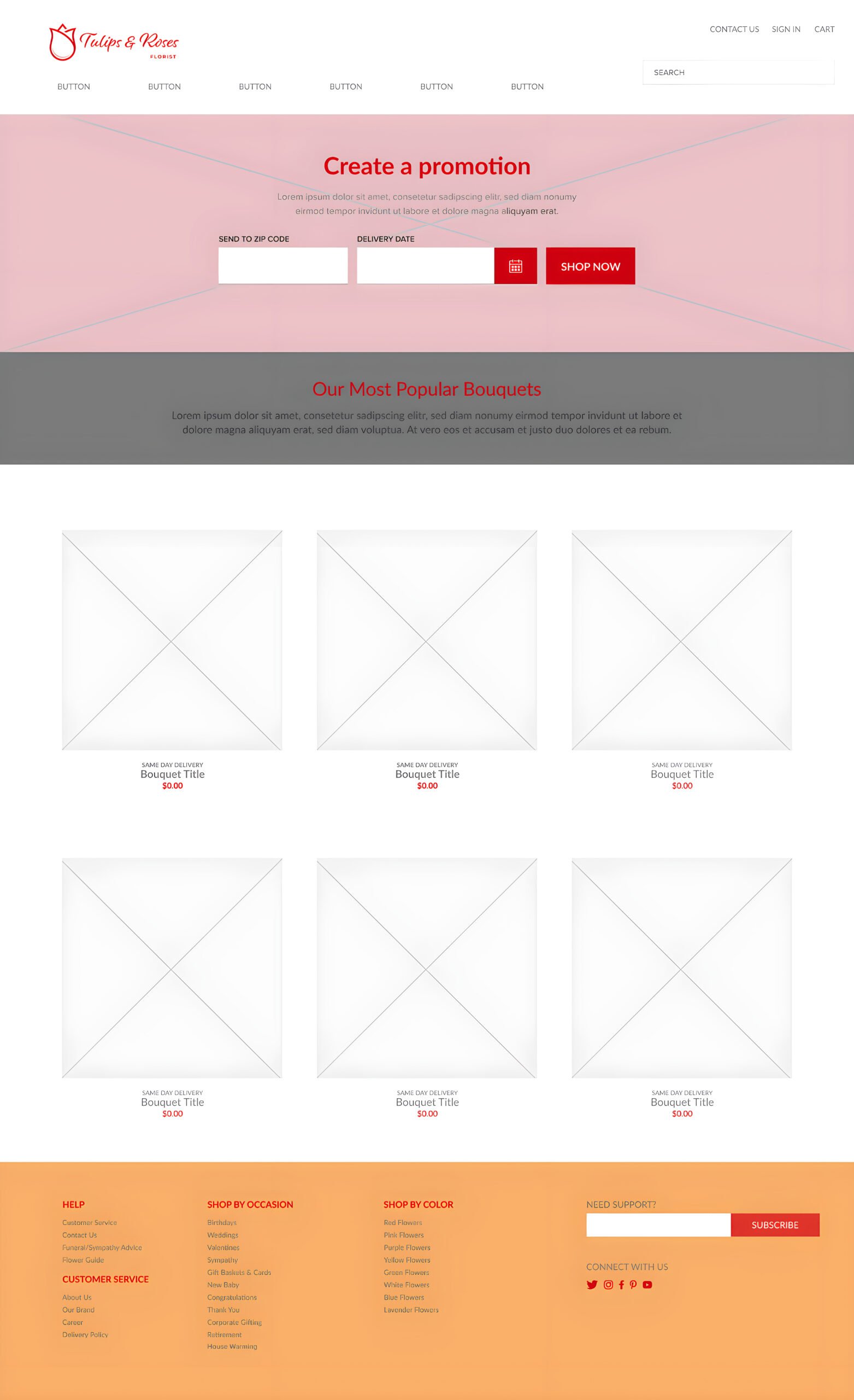
The high-fidelity Tulips & Roses website mock-up combines the brand style tile and client requirements with a clear, accessible interface. A grid-based layout, consistent typography, purposeful imagery, clear calls to action, and persistent navigation work together to create an organized and visually engaging user experience.
User Experience
The interface applies contrast, alignment, proximity, and repetition to support usability. Clear typography, accessible color combinations, and structured content placement help users navigate the experience efficiently.
Visual Hierarchy
Promotions and featured bouquets are positioned prominently, while typography, spacing, and layout guide users from primary headings to supporting information.
Navigation
A persistent navigation bar supports movement between pages, while the footer provides important details and secondary navigation links.
Visual System
The interface consistently applies the Tulips & Roses logo, brand color palette, Lato typography, and floral imagery to create a cohesive visual identity across the website.